工具|选项发生了什么变化?
译者:hxhgxy 来源:http://blogs.msdn.com/excel
发表于:2006年7月7日
Whatever happened to Tools|Options?
工具|选项发生了什么变化?
In the course of writing this blog, between comments and direct emails, I would estimate that I have fielded over 1,000 questions. Of those, only one had anything to do with Tools|Options, which I found to be a surprisingly low number, given how often I hear people comment about it when I am talking to customers on the road. Like most of the UI in Office2007, Tools|Options has had a significant makeover (it is gone, really, replaced by a new design). Today I want to give an overview of those changes.
在写本博克的过程中,在建议和直接的电子邮件当中,我估计我碰到了上千个问题。在这些问题中,只有一个和工具|选项有关,这是个令人惊讶的小数目,要知道当我在路上与用户交谈时,他们是多么频繁地提到它。和Office 2007中的大多数UI(用户界面)一样,工具|选项有下显著的修改(实际上它不见了,被一个全新的设计所替代了)。今天,我想给这些变化一个概述。
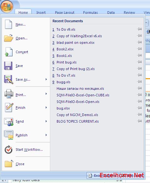
To start, let’s see where the functionality that was Tools|Options is located in the world of the ribbon. When you look at the contents of the File menu, you will see that there is an “Excel Options” button right next to “Exit Excel”.
首先,让我们来看看具有工具|选项功能的东西在彩带世界中的哪个位置呢?当你查看文件菜单的内容时,你将看到在“退出Excel”按钮的右边有个“Excel选项”按钮。

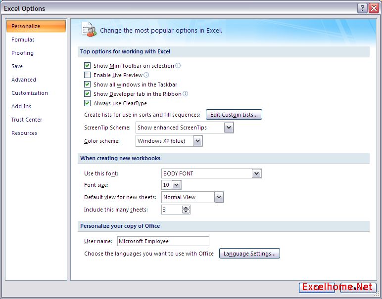
When you press the button, you will see the new and improved experience for setting options in Excel (the examples I will walk through are all Excel, but the same thing has been done in Word, PowerPoint, Access, etc.).
当你按下该按钮,你就会看到一个新改善的Excel设置选项(我将演示的例子都是Excel的,但是Word,PowerPoint,Access等等都做在相同的变化。)

One of the key things we are trying to do with the dialog is expose of the more important settings in the dialog clearly so they are easy to find and easy to set. Over the years, we have added many settings – some more useful than others – and as a result, it has become difficult for all but the most stalwart users to locate the interesting settings from the pile. This new design puts the most commonly changed settings up front, clears out settings that are infrequently changed to the “Advanced” tab, and allows us to categorize the rest into recognizable sections.
我们试图要做的与该对话框相关的关键事情之一是将更多重要的设置明显地放置在该对话框中,这样就任意找到并设置它们。几年来,我们添加在许多设置——一些比其它更有用的——结果呢,除了一些有毅力的用户外,要从这以大堆设置里找到感兴趣的变得很难了。新的设计将最通常更改的设置放到前面,将那些不经常更改的设置清理到“高级”页上,并且允许我们将其余的归类为容易识别的组合。
Another thing that you may notice are small “i”s besides some of the items. Hovering the mouse pointer over these icons will display a super tooltip providing a reasonable amount of information on what, specifically, the setting does.
你可能会注意到的另一件事情是某些项目旁边的小“i”。将鼠标移到这些图标上面时,会显示高级提示,提供大量的有关该设置具体是什么,到底干什么用的信息。
Tomorrow, I will go through all the different tabs on the options, but before I signed off for the day, I wanted to point you at a post in Jensen Harris’ UI blog. The design I describe above is actually the second redesign of Tools|Options as part of the Office 2007 release. As those of you that used our first beta may remember, the first redesign of Tools|Options contained something called “expert mode”, which was our first attempt to simplify the whole experience. It didn’t quite work out the way we had envisioned, though, and after significant feedback from beta participants, the UI team came up with this second design. You can read all about the process it in this post.
明天,我将演示该选项上的所有不同的页,但是,在我今天结束之前,我想给你介绍一篇Jensen Harris’ UI博克上的帖子。我在上面描述的设计,实际上是Office 2007版本的第二次工具|选项的设计。作为你们中使用过我们第一个beta版的人可能会记得,工具|选项的第一次重新设计中,包含一个叫做“专家模式”的东西,它是我们第一次尝试简化整个设计。虽然和我们预先想象的设计不一样,但是,在获得很多对beta版使用的反馈后,UI团队出来了这个第二版设计。你可以在这篇帖子里了解这整个过程。
Published Monday, May 22, 2006 11:10 AM by David Gainer
Filed Under: PDF, Undo, Other Improvements
注:本文翻译自http://blogs.msdn.com/excel ,原文作者为David Gainer(a Microsoft employee),Excel Home 授权转载。严禁任何人以任何形式转载,违者必究。
Excel2007版权声明
本文来自投稿,不代表本站立场,转载请注明出处。
